Search This Blog

Monday, June 10, 2013

Tricks of the Trade: Reveals


An architectural whisper of a statement, reveals are anything but transparent.  In fact, they offer full disclose for the areas into which they are set.  If that sounds paradoxical it’s because the detail itself is not apparent to the observer.  Rather, reveals are actually inward planes that are not fully visible; they are, in effect, in shadow.  It’s as discrete and powerful an architectural element as the Palladian triumvirate is in creating harmony and balance in space.

Reveals are subtle grooves; they are voids in the sense that the absence of space they create causes its contiguous spaces to appear special.  The void, the inside surface’s dimension is usually only 1/8 to 1/2” wide and 1/8 to 1” deep (depending on where it is situated).  The recess is such, that even if colored, you would barely see much of anything, as its obscurity is functional.  Then, what do these hidden inward planes do?  What is their purpose? And, do they have any kind of aesthetic significance?

Firstly, reveals are found in between parallel planes.  A void separating elements such as the window and the wall, or between the floor and the wall above, or the in between spaces of the chair rail or molding, between the countertop and cabinet below, essentially between any two coinciding planes,  a reveal affects the entire plane upon which it is situated.   These grooved out spaces are created by carving out a linear space from a positive; it is a void.  It is negative area that defines and informs the space around it.   Thus, if a reveal exists between the door opening and its contiguous wall, it will make the door opening appear as though it is somewhat floating off the wall, creating a lightened effect.  Poised at the bottom of an entire wall, where it is recessed a substantial distance in from the surface plane, a reveal will make the wall look as though it were suspended in the air, lifting the wall off the floor.  In these instances, reveals will make a very heavy element (wall) appear somewhat weightless.  A reveal at the ceiling creates a similar effect, enhancing a light, airy ethereal feel. Here, The observer’s eye will immediately give the illusion of it not being connected to the ceiling, though it is.  

When used as a chair rail or baseboard element, a reveal gives that molding a lighter, more sculpted look by breaking up the monotony of the surface plane.  Reveals used between countertops and cabinets give the appearance of a floating top, thus lightening the visual heaviness of the two elements together.  In effect the emptiness of these obscurities makes the spaces into which they are placed appear to float.  Think of the break in a musical composition or in a line of poetry - the caesura, in effect, is analogous to the reveal.  These musical stops, these poetic breaks, are negatives that make the lines to which they are attached more powerful.  So, too, the reveal.....

What makes reveals revealing? ....their full disclosure.  

Saturday, August 11, 2012

TRICKS OF THE TRADE: DESTINATION POINTS


What are destination points?  They are location areas upon which the eye naturally falls.  Spatial circumstances naturally form these focal points and, as such, create strong visual draws. For instance, when you open your front door what to you see?  Is it an amorphous room with the eye focusing on the nondescript windows beyond?  Or, is it some interesting object or niche or wall upon which the eye can delight. 

One can actually alter these natural resting areas by creating your own focal point and diverting the natural course of events.  This is a type of magic that the designer / architect performs and is accomplished by simply changing what is before us.  So, if you want to open your bathroom door and not see, what is usually there, the toilet, change the plumbing and place the sink there instead.  If you can’t make any structural changes, place a great piece of art or object d’art above the water closet, diverting the eye.  This will accomplish the magic, unless the toilet is a wonderful object, like Kohler’s hat toilet, which is a great piece of art unto itself!

What about opening the door and seeing nothing special?  Create an entry foyer!  Or, simply make the area upon which the eye falls something of interest. Perhaps, the wall in front of you needs some special treatment, like a different color.  It can even be accomplished with the placement of a beautiful piece of furniture with a mirror above. In addition, as doors usually open into formless open spaces with windows directly ahead, drapery treatments become the focal point.  However, making them interesting something to “look at will change it all, flipping out boring and dull for attractive and bold.

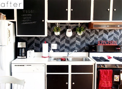
And the kitchen?  Here, the backsplash is the area in which to concentrate.  This area can make or break the kitchen, so make sure it becomes a strong destination point!


“Abby’s Footnotes”

Destination points are always a thrill to create.They are the equivalent to creating a stage in a play. “What will your guests see first when you open the curtains?” Play with different ideas in a foyer or in a living room. Paintings, color and accessories all attribute to an interesting destination point. When your guests enter your home, make sure to wow them!  


Thursday, July 19, 2012

TIPS AND TRICKS OF THE TRADE: BACKSPLASHES


As a small area of the entire kitchen, the backsplash has enormous impact.  This is because this rather narrow strip of surface is situated at about eye level, where a person’s visual orientation is comfortably set.   Therefore, it’s really important that great thought and care go into choosing the proper application.  While there are many surfaces from which to choose - marble, granite, glass, paper, paint, wood, mirror - the backsplash needs to make a statement.  If you love color, here is the place to add it!  Should you like to be whimsical and / or inventive, this eye-catching location is perfect.  One can even mix colors and finishes, i.e. wood in stone.  The backsplash doesn’t even have to necessarily relate to the other materials used in the kitchen, as long as it is proportionally correct.  This is where you get great return on your investment.  


{Abby’s Footnotes}


By now you must know that I love design that is “out of the box”. These backsplashes are awesome! Hey, if you’re not totally committed to doing something fun in a large area of the home, try a small area such as a kitchen backsplash. Cooking should be fun…

Chalk Backsplash

Black and White Photos Backsplash


TRICKS OF THE TRADE: Ceilings


Want to make a space look taller than it is?  Even an 8' high ceiling can look taller! Here is a trick of the trade: a ceiling will look higher if the ceiling prior to it's entry is dropped.  That is, drop the ceiling of the adjoining space, even if it is by 6", and the space one walks into from it, will feel much higher.   Below are other ways to enhance the most unadorned surface of your home.

Angelo Dongia, the famous interior designer, referred to the ceiling as the most ignored, but interesting, of the six planes. Fortunately, it hasn't always been that way. Michelangelo and his patrons didn't exactly perceive it as such. All the great architects through centuries past have 'looked up' and found an interesting surface to adorn. It seems that with the advent of the hi-rise apartment and its lowered top, the ceiling has seen better days. Not to despair. With all of the other five surfaces well explored, the design/decoration of the ceiling has much left to offer the design professional and enthusiast.  

There are several options in considering the design and decoration of this sixth surface. It can be painted, carved, plastered, upholstered, covered with glass, covered with metal, wallpapered, tiles, beamed, mirrored, leathered, trussed, and any combination thereof. The purpose behind its decoration is both aesthetic and/or functional. Thus, aesthetically it can be pleasing to the eye, while functionally, it can house lighting, define space, and carve out great sculptural shapes (i.e. skylights, domes, etc). For those optimistic, spiritually minded, the ceiling is a refuge of delight that both enhances and embraces the space at large. Let us consider some of these applications to see how successfully the ceiling can accomplish its art.  
Perhaps the most obvious application is that of painting the ceiling. But even within this genre, there exists a multitude of choices. Faux paint such as striae, trompe l'oeil, abstract motifs, silver or gold leafing, and just plain paint (in perhaps a different color) represent just a sampling.  Another technique, which has survived the centuries, but not now as predominant, is that of the plastered ceiling. 

More recently, the ceiling has been adorned with wallpaper or fabric (which includes leather). Not only wise for sound insulation, this use can provide an interesting, warmer aspect to the environment. Some designers even tent the fabric, gathering it at the top as to suggest an Eastern, oriental feel. Mirrors have been used on the ceiling as well, but mostly in bachelor pads and discos. Its counterpart, glass is used in more functional ways, admitting light and creating a halo-like aura. Skylights, as they are commonly referred to, enlighten and add to the breath of the room in which they are situated.

On the more architectural side of ceiling design is the carved dome, dropped surface, beamed structure, and opened space all serving a specific yet aesthetic function. For instance, by carving out a section of the ceiling in the shape of a circle, square, oval, etc., the designer actually defines the space below. As in the picture illustrated, the sculpted ceiling gives that designated space definition; it makes it special. It lets you know that it is a space unto itself; it's not just walk-through circulation. The modern beamed ceiling accomplishes the same thing; only it's more architectural in feeling. It draws lines in the air, overhead, telling you where and what your limits are spatially. In addition, by creating coves or dropped beams at the ceiling, lighting can be housed and wires concealed. Cove lighting combined with some ceiling sculpture can create very interesting, atmospheric effects. Functionally, through the use of dropped soffits and beams, the ceiling can house all types of electrical and audio wiring, air conditioning ducts, vents, recessed down lights, and speakers to name a few.  
The "Ceiling" has resurfaced. In recognizing both its aesthetic and functional capabilities, the designer now sees the potential of this forgotten surface and the advantages of "Looking Up." 


“Abby’s Footnotes”


In my opinion a well designed ceiling is the “wrapping paper” of great design. It shapes the room and gives it character. Before you decide on what color sofa to buy or what drapes to hang, try to give your ceiling some attention. It will give your room a finished and professional look. You can easily dress up your ceiling with hanging fixtures, but an added detailed such as simple cove adds a bit more interest!


Monday, July 2, 2012

TRICKS OF THE TRADE: CABINETRY


By not intruding onto valuable floor space, BUILT-IN CABINETRY is a perfect space saver.  Because they are built-in, these cabinets are recessive and, thus, inconspicuous.  In effect, they are part wall, part furniture.  As an extension of the walls to which they are connected, built in cabinets have doors and drawers, tops and bottoms.  They are generally ‘quiet’ pieces of furniture, subtly performing their valuable function.  Built-ins look as though they have been comfortably couched within their locations forever.  As they are custom-sized to fit a particular area and, as such, are not detachable, this form of cabinetry serves as a permanent fixed element to the surrounding architecture. 

Built-ins can take the shape of benches, window seats, dining buffets, bookcases, beds, media centers, etc..  Any piece of furniture that is attached to the wall is ostensibly a built-in.  For instance, modern kitchen cabinets, specifically proportioned and designed to fit within two site specific walls, perhaps under a soffit, covered with a custom sized stone top are considered built-ins.  In addition, this cabinetry can display moldings, wood trim, ornamental plasterwork - just about any feature that a free-standing piece of furniture incorporates. 


{Abby’s Footnotes}

Built-ins are lifesavers. Being discreet and compact, they can conceal all your unattractive items while maintaining a beautiful space. My favorite built-ins are bookshelf walls. They create texture and a focal point in a room. Not to mention they are fabulous blank canvases to decorate with beautiful accessories. 


Monday, June 18, 2012

TRICKS OF THE TRADE: POCKET DOORS


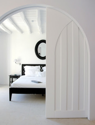
POCKET DOORS create magic by disappearing into walls and economizing space.  They save on space because the extra clearance space that a regular door requires is here not necessary.  Adding an average of ten square feet of floor space, these doors are perfect for a small apartment or room. In addition, POCKET DOORS allow for the use of some interesting and beautiful hardware, as they require an ingenious flat pull.

Doors define spaces; they separate and distinguish one from another.  They divide the exterior from its interior, and one room from another.  In this sense, they function as moveable walls which are hinged, tracked, concealed, divided, and applied with as many types of materials as the imagination can divine.

Great for saving space while dividing one room from another, POCKET DOORS disappear and reappear when needed.  They are magical!


{Abby’s Footnotes}

Although pocket doors are hidden in a wall, they can provide an opportunity to create an interesting focal point. I really adore these arched pocket doors. It’s a great way to maintain the beauty of an arch while creating privacy with a door. Also, different materials can be used on pocket doors. Glass, wood and metal are great options. Be creative when designing your door. The possibilities are endless.


Monday, June 11, 2012

TRICKS OF THE TRADE: ANTECHAMBERS


ANTECHAMBERS are transition spaces leading up to and just prior to a room’s entry.  These subtle areas bridge one larger space to another.  They are most effectively defined by creating an element of surprise when walking through its passageway.  Usually the antechamber will have a dropped ceiling thereby creating a heightened effect when entering the main room to which it is annexed.  Designed to create suspense for what is to come, these ancillary rooms are like poetic caesurae, a breathing area eliding space to space. 


{Abby's Footnotes}


What’s cool about an antechamber is that you can play with the shape of the ceiling and elements in the room. Help add to the drama of an entrance with an interesting ceiling detail or as seen in the pic, draw the eyes upwards with dramatic columns. When decorating this area try not to overload it with too much decorations and accessories. Keep the focus on the architecture and the lighting.